
How to make typed text look like real handwriting
To make typed text look like real handwriting in HandtextAI, turn on the Realism switches, keep the writing on the lines of the paper, and choose a size and an ink a pen would give. Natural movement is free, Inkflow needs the Starter plan and Vary each letter needs Pro. Then pick Print for paper or Photo for a picture.
A handwriting font alone does not look like handwriting: every “e” is the same “e”, every line is perfectly straight, and the ink has one weight throughout. HandtextAI has a setting for each of these differences. This page goes through them and says which plan each one needs.
Short answer
- Paste your text into the editor and choose a handwriting you can read over a whole paragraph.
- Open Realism in the look bar and turn on Natural movement (free). Add Inkflow (Starter) and Vary each letter (Pro) if your plan has them.
- Choose a ruled or squared paper and keep Write on the lines on, so the writing sits on the printed lines.
- Choose Print if the page will be printed, or Photo if you want a picture of a notebook page.
- Read the page through, then press Download.
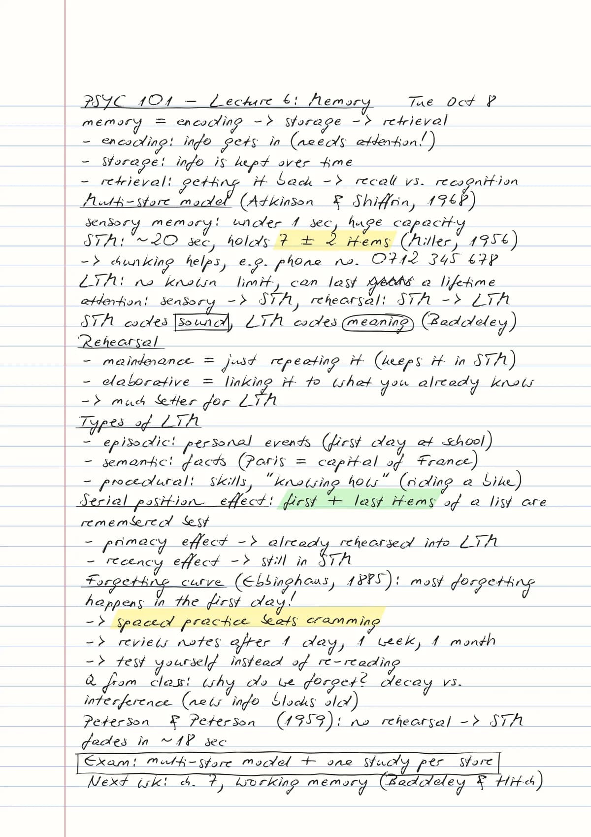
Which Realism settings should I turn on?
The Realism chip in the look bar opens a sample of your writing with its switches.
| Switch | What it changes | Plan |
|---|---|---|
| Vary each letter | The same letter is written differently each time, so repeated letters never look exactly the same | Pro |
| Natural movement | Words, line starts and line spacing shift a little, like a real hand | Free |
| Inkflow | Pressure changes stroke by stroke, like a real pen: firm strokes stay solid, light ones turn thinner and paler | Starter |
Start with Natural movement, which is off until you turn it on, and add the others if the page still looks too even.
- Natural movement has three amounts behind Advanced settings: Word placement, Line starts and Line spacing.
- Vary each letter works with every built-in handwriting except Font 81, and not with a font you uploaded. It pauses while letter spacing isn’t 0 or letters are tilted.
- Inkflow shows best on Print pages.
- Tilt each letter gives a hand-printed look and suits print-style handwritings. It turns Natural movement off, so use one or the other.
You can try every switch in the preview without a plan; only the download needs it. More in How to use: Realism.
Why keep the writing on the lines?
Text that floats between the rules of lined paper does not look written by hand. On ruled and squared paper, Write on the lines puts every line of text on a printed line. Line spacing is then counted in whole lines (1, 2 or 3), and on 5 mm squares one line of text takes two squares. It turns on by itself when you move from plain to ruled paper, and it is free.
The paper matters too. Plain, College Ruled and Wide Ruled are free. The paper list’s country menu has school papers for Germany, France, India, Russia and Ukraine, among others; those need Pro.
Should I use Print or Photo?
Print makes a flat page for a printer: you choose the paper, the page size and the margins. Print it at 100% scale on the size you chose, and the result is ink on real paper.
Photo writes your text into a photographed notebook or exercise book. Use it when you want a picture to send or post. There are 15 photos, and with Randomize scenes each page gets a different photo of the same notebook. Photo pages need Pro to download. See Print or Photo and the recipe notes as a notebook photo.
Which handwriting, size and ink look natural?
- Handwriting: judge it on a full paragraph, not one word. The font browser marks Fonts 7 and 96 as Recommended; both are free. For joined writing, see convert text to cursive handwriting.
- Size: the default is 26, and the ruled examples use 24 to 26. If letters touch the line above, lower Size or set Line spacing to 2 lines.
- Ink: blue or black. The inks are at the top of the handwriting chip’s panel.
- Your own handwriting: with Premium you can upload a font made from it (how to make one).
Why does my page still look typed, and how do I fix it?
| What you see | Fix | Plan |
|---|---|---|
| Every repeated letter is identical | Vary each letter | Pro |
| Lines are perfectly straight, with the same left edge | Natural movement | Free |
| The ink has the same weight everywhere | Inkflow | Starter |
| The writing floats between the printed lines | Write on the lines | Free |
| A word has a blank or an empty box in it | Pick a handwriting that has the character | Free |
| A flat page sent as a “photo” | Photo | Pro |
These settings are for pages that should read naturally: notes, letters, cards and worksheets. If your school or an exam asks for work written by your own hand, follow that rule.
Questions
Which settings make HandtextAI handwriting look most realistic?
The three Realism switches together: Vary each letter (Pro) writes repeated letters differently, Natural movement (free) shifts words, line starts and line spacing, and Inkflow (Starter) changes the pen’s pressure stroke by stroke. Add Write on the lines on ruled paper, so the text sits on the printed lines.
Is realistic handwriting free?
Partly. Natural movement, Write on the lines, the eleven free handwritings and plain or ruled A4 paper are on HandtextAI’s Free plan, with 5 pages to download. Inkflow needs Starter, and Vary each letter and Photo pages need Pro. Everything can be previewed free. The plans are on the plans page.
Why do the same letters look identical in my page?
Without Vary each letter, every “e” on a page has the same shape. With it turned on, HandtextAI writes the same letter differently each time, so repeated letters never look exactly the same. It needs the Pro plan to download and works with every built-in handwriting except Font 81.
Which handwriting looks most natural?
It depends on the text, so compare a full paragraph in a few of them. HandtextAI’s font browser marks Fonts 7 and 96 as Recommended, and both are free.
Recipes
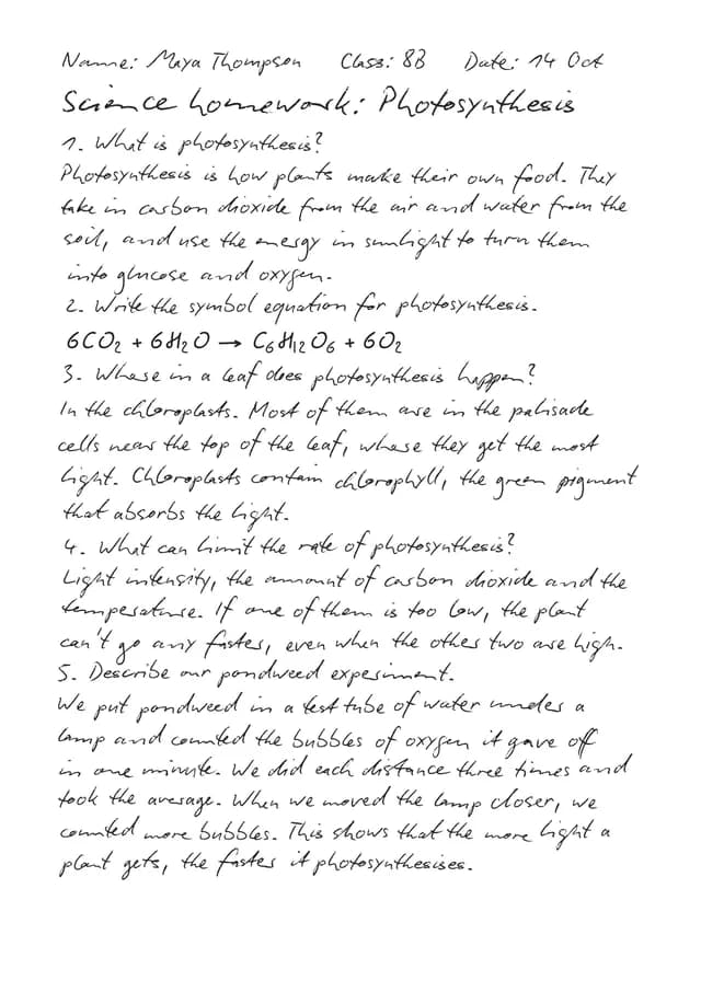 Homework assignmentFont 7 · Plain · A4
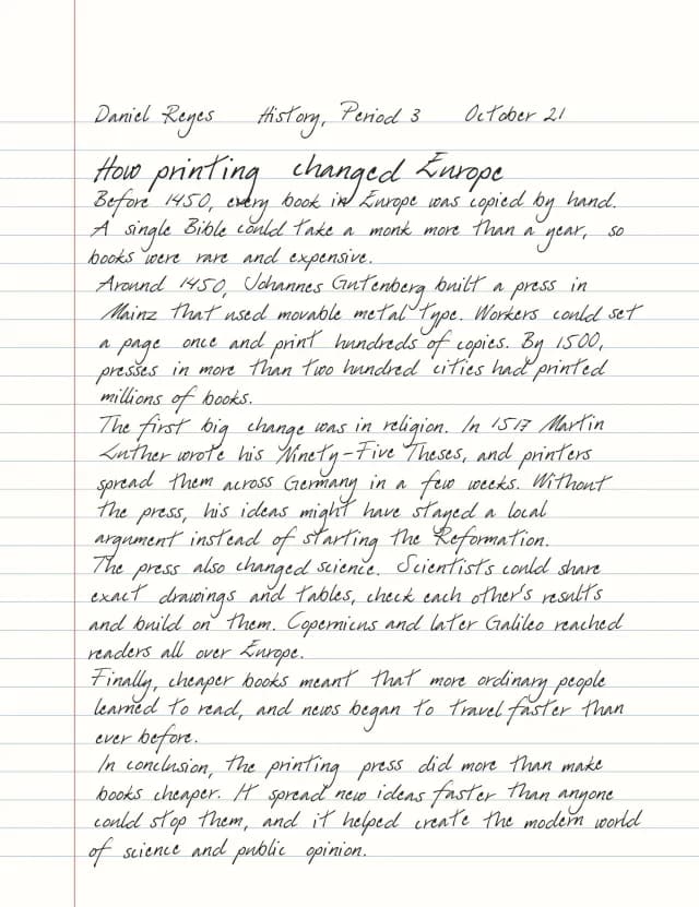 History essayFont 96 · Wide Ruled · Letter
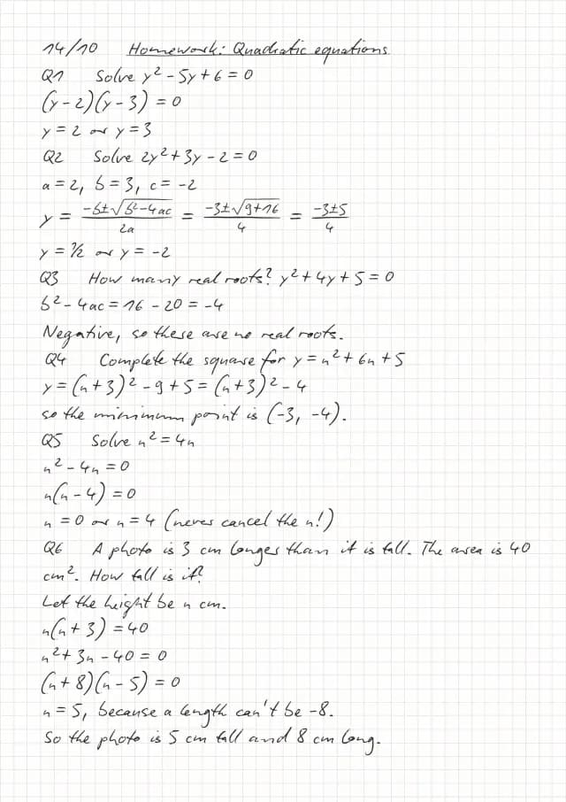 Maths on squared paperFont 7 · 5mm Squared
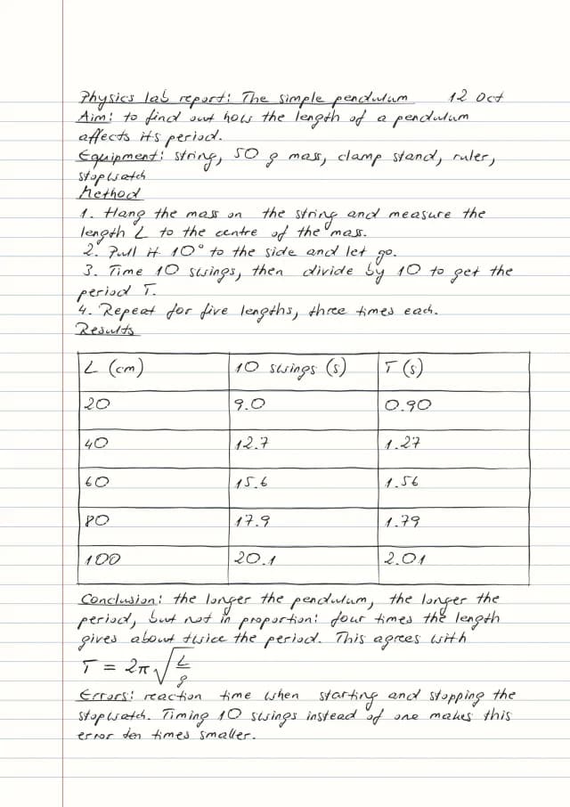 Lab reportFont 2 · College Ruled · table
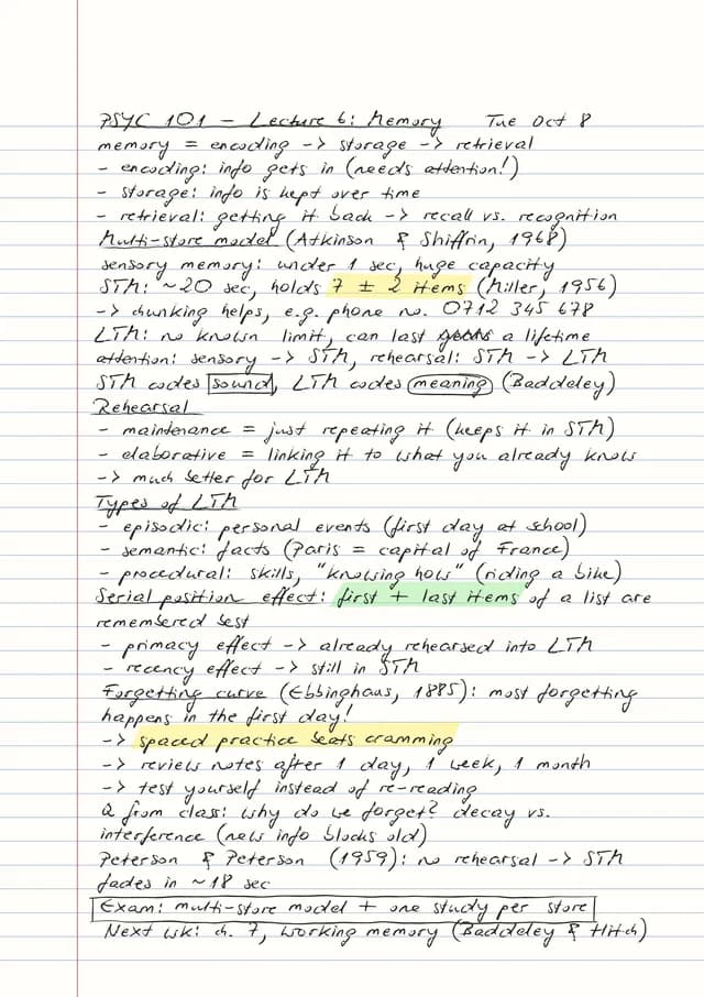 Lecture notes with marksFont 2 · College Ruled · marks
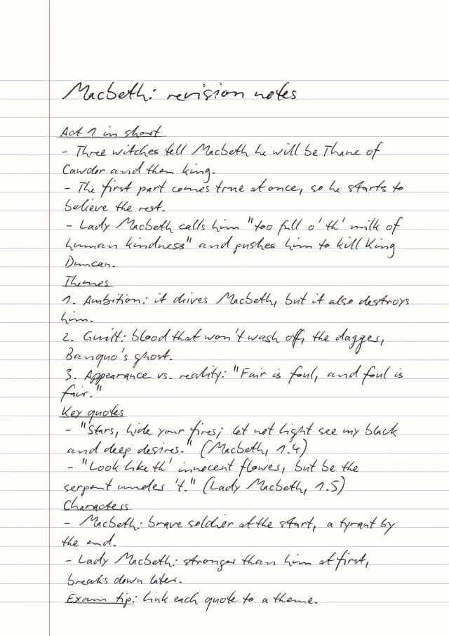 Revision notesFont 7 · Wide Ruled
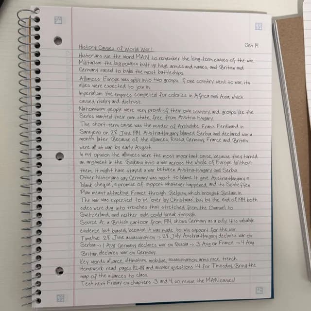 Notebook photoFont 10 · Ruled Spiral photo
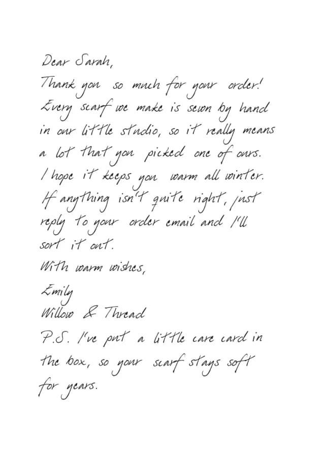 Letter or cardFont 96 · Greeting card
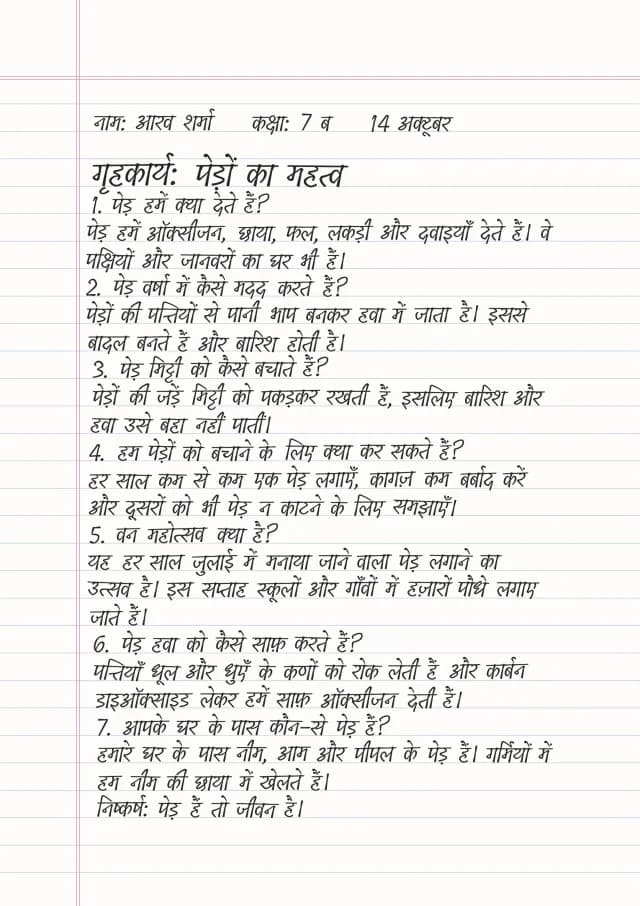 Other alphabetsHindi, Cyrillic, Greek, Arabic…